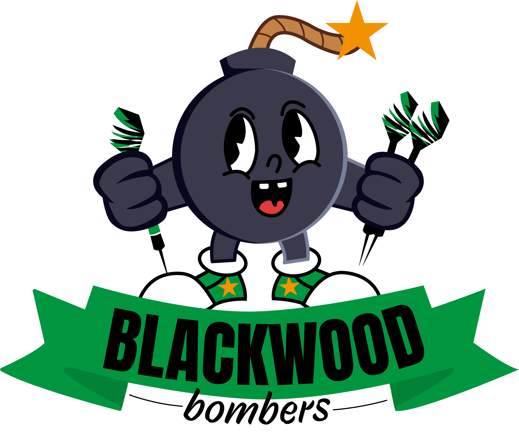
This live brief focused on transforming a generic darts logo into something with more character and relevance to the team. The rebrand centres around a cartoon-style bomb mascot, a playful yet bold symbol that brings energy and character to the visual identity.
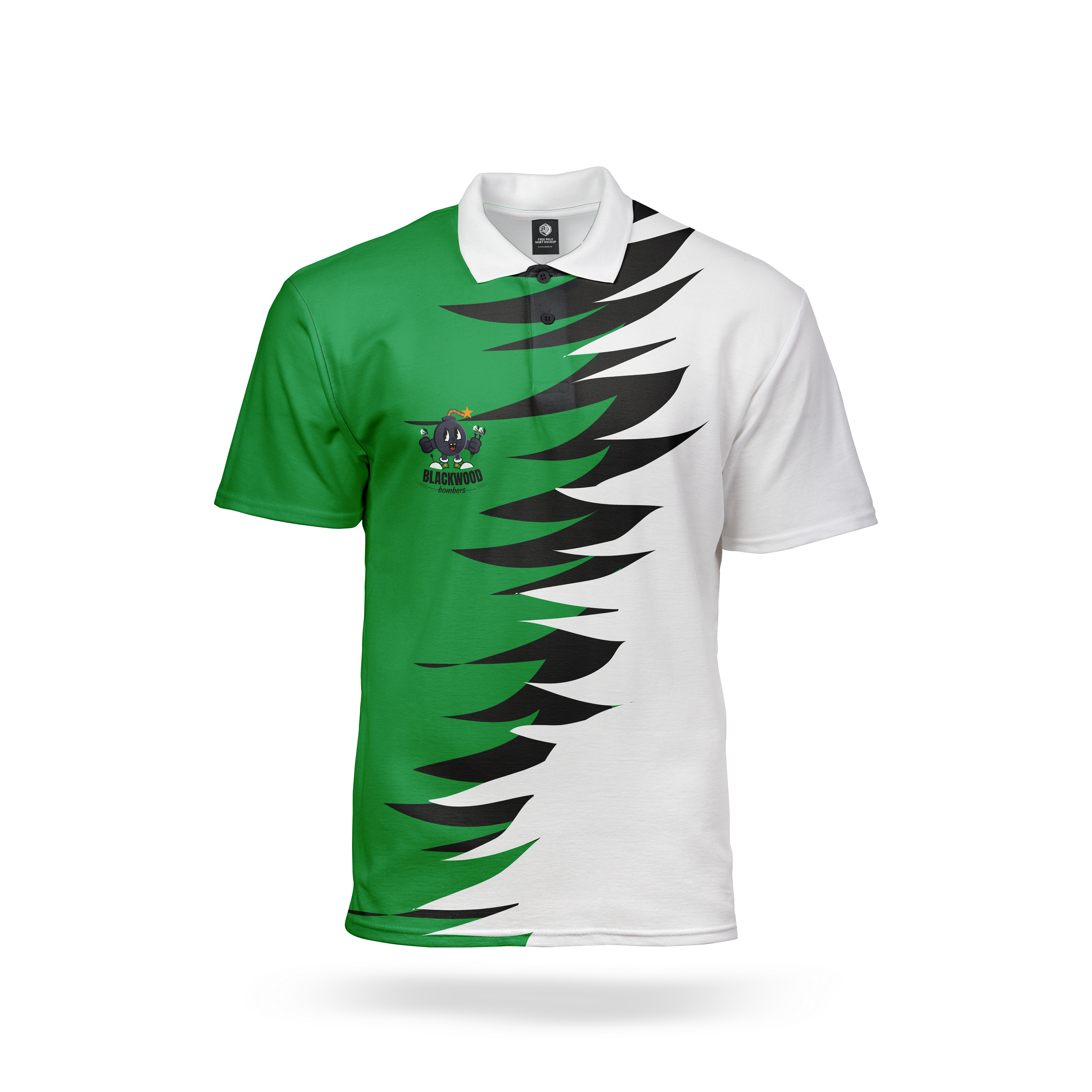
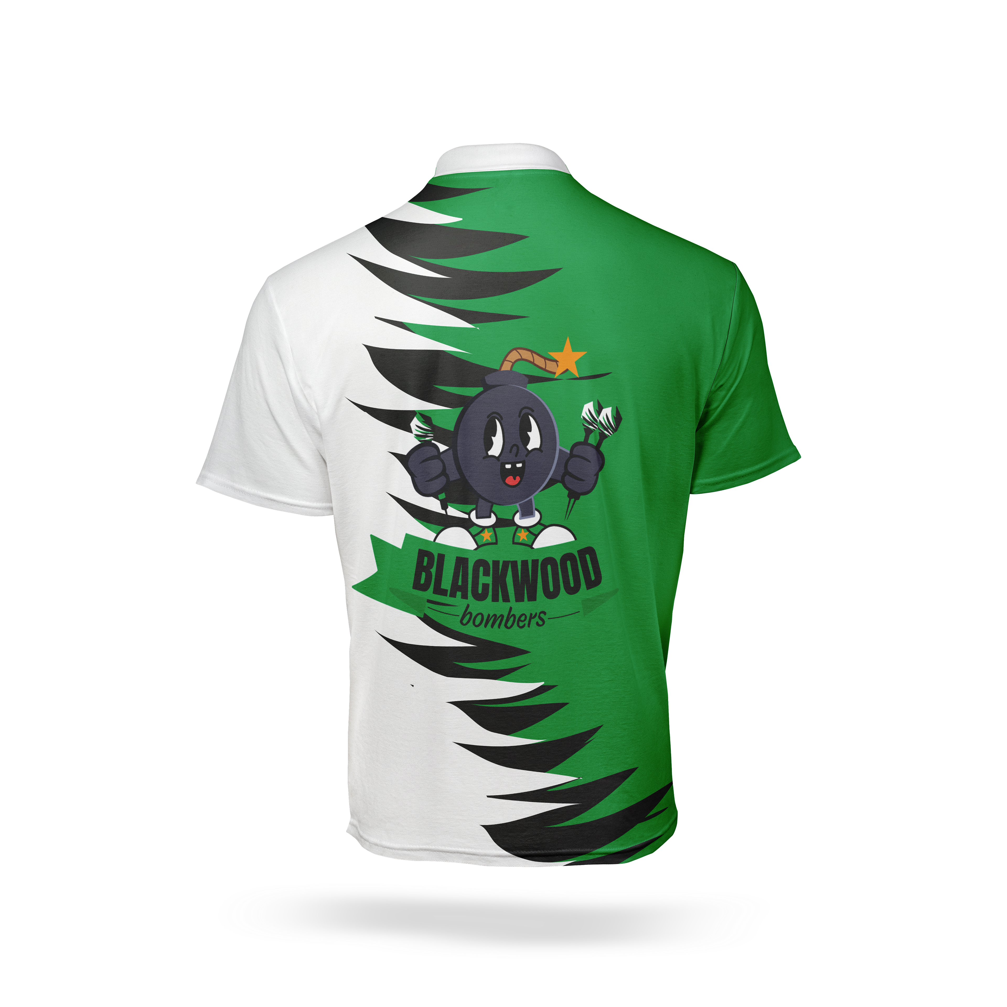
Taking inspiration from Blackwood Stars Rugby Club, as the team is affiliated with, I ensured that the colours palette aligns seamlessly across both teams for a cohesive visual connection. The overall design draws from the team’s previous shirt graphics, blending familiarity with fresh, expressive visuals. By using cartoon-inspired imagery, the branding creates a stronger emotional connection with supporters, fostering a sense of community and pride around the team